
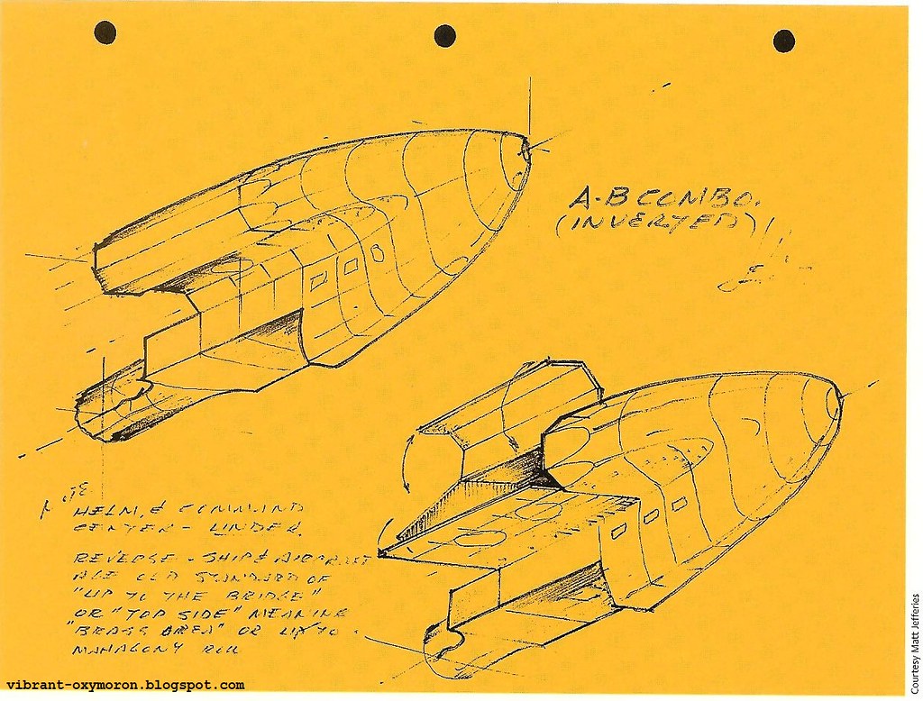
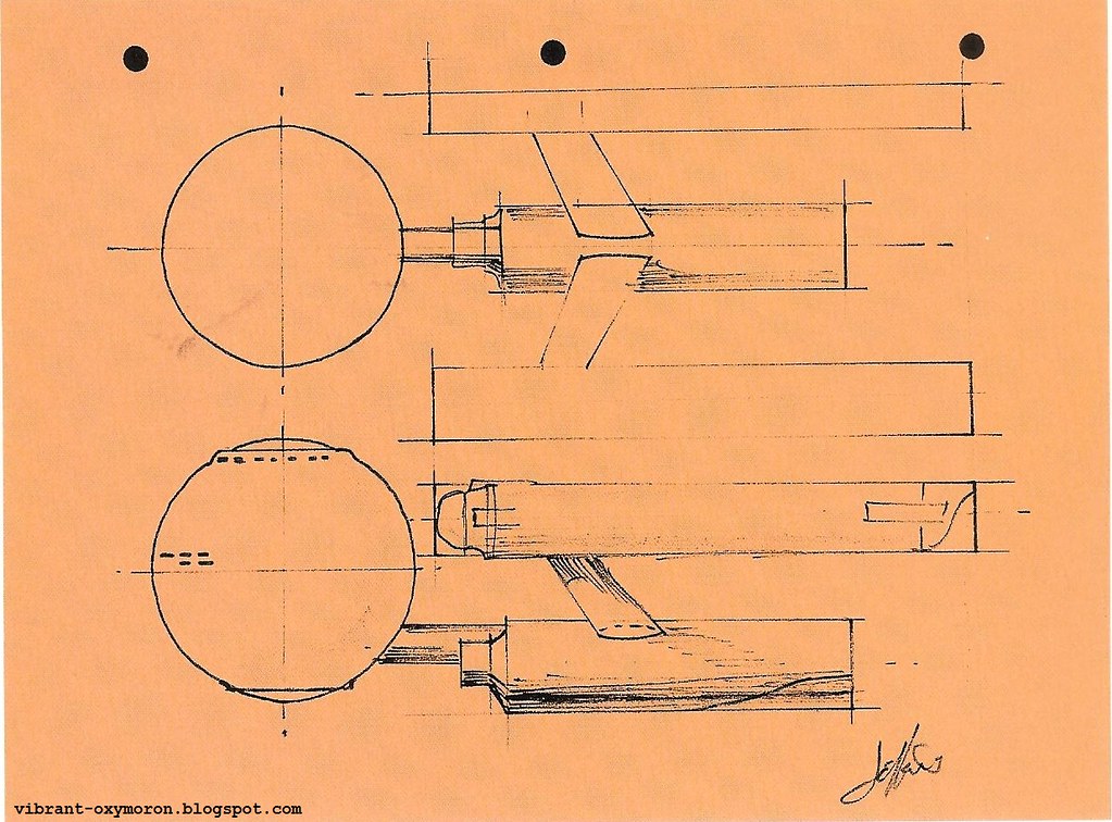
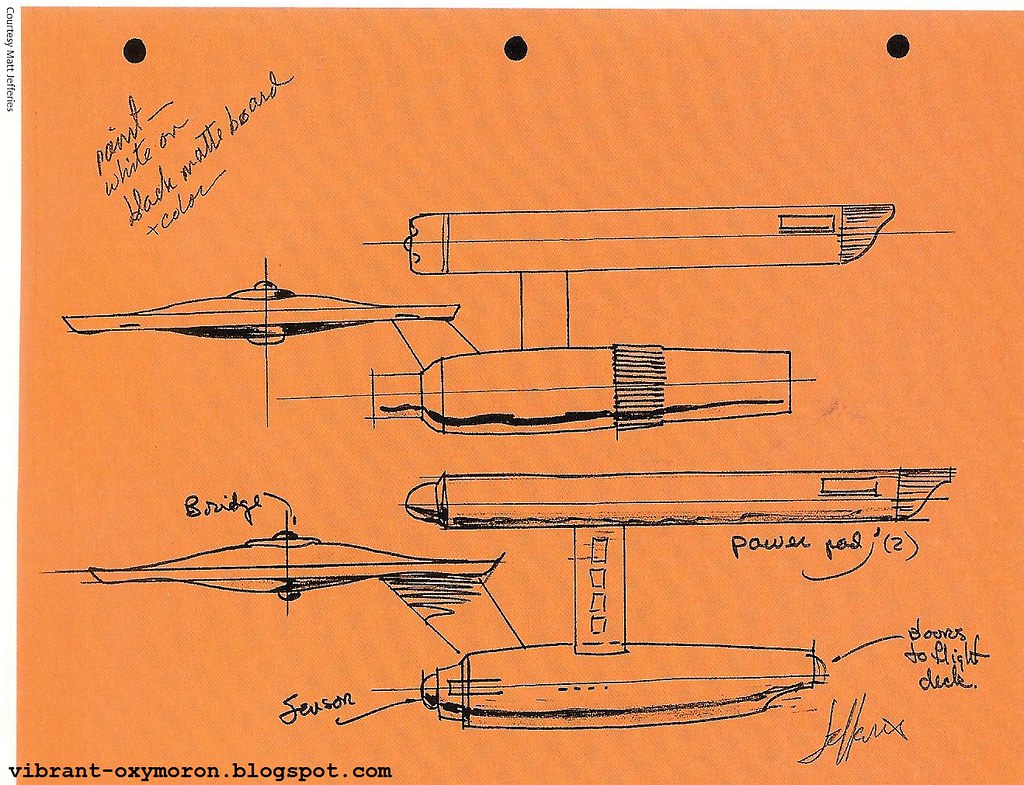
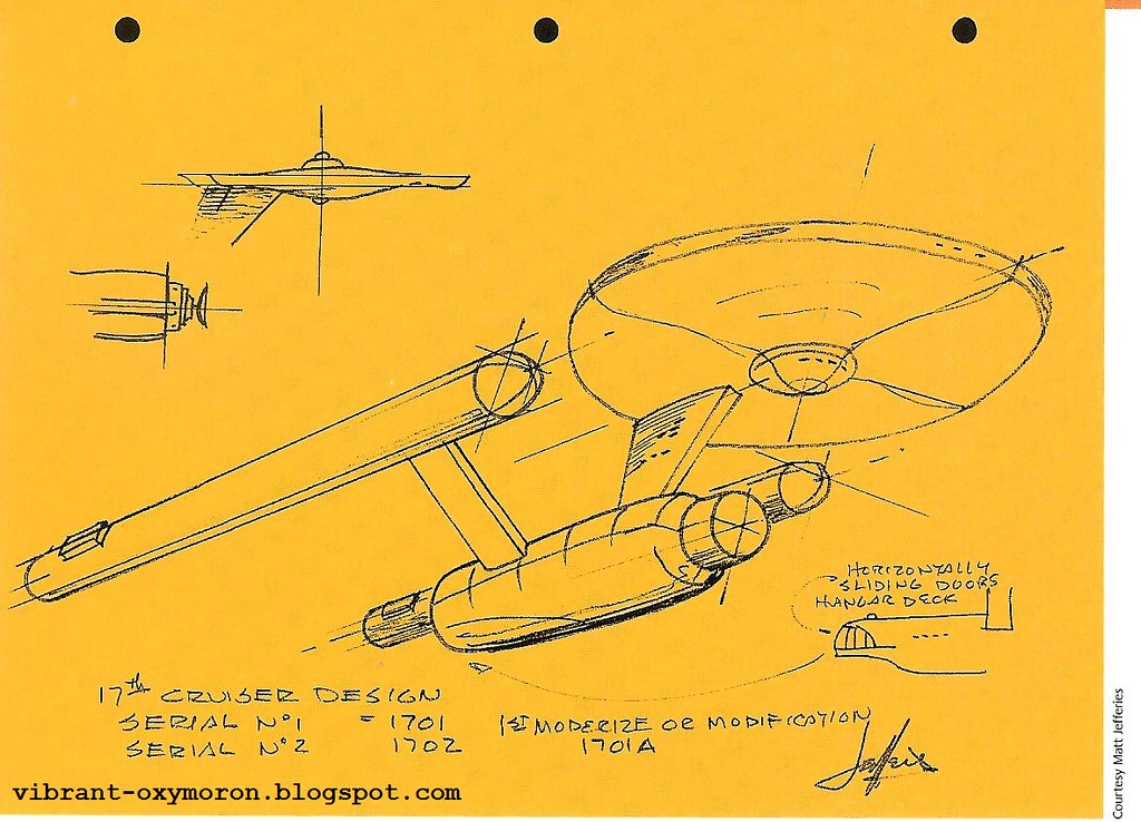
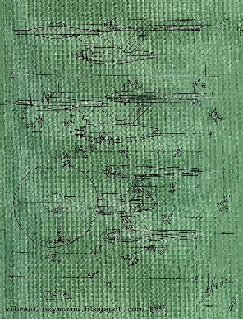
Walter Matt Jefferies, a skilled aviator and mechanical artist, designed both the interior and exterior of the original Enterprise. I have scanned some of the sketches he had made while designing the enterprise from the Star Trek Sketchbook (The Original Series), which can be enlarged by clicking on them.

"Outer space is probably the worst environment for a humanoid - even worse than being under the ocean. Without outside help, there's no way you can live. And since anything that man makes can break down, why put equipment outside the hull, where you'd have to go outside the ship to fix it? That - and my desire to play color off it - was the reason I kept the Enterprise exterior as plain as possible." - Matt Jefferies
According to Jefferies, the Enterprise was given a designation without a profound reason for it's sequence, seeing as a serial number had not been decided on:
"Since the 1920's, N has indicated the United States in Navy terms, and C means "commercial" vessel. I added on the extra C just for fun. Interestingly, Russia's designation is CCC. So the N and the C together made it kind of international.
After that, I had to pick some numbers. They had to be easily identifiable from a distance, so that eliminated 3, 8, 6, 9, and 4 - none of which is that clear from a distance. That didn't leave much! So 1701 was as good a choice as any. The reason we gave for the choice afterwards was that the Enterprise was the 17th major design of the federation, and the first in the series. 17-01!" - Matt Jefferies
When designing the ship, which would have warp drive, he wondered what that would even mean:
"What the hell is warp drive? But I gathered that this ship had to have powerful engines - extremely powerful. To me, that meant that they had to be designed away from the body"
"The other thing is what we called during war a Quick Change Unit. By having the engines out there, if anything is wrong, you can just quickly unhook it and put another in its place." - Matt Jefferies
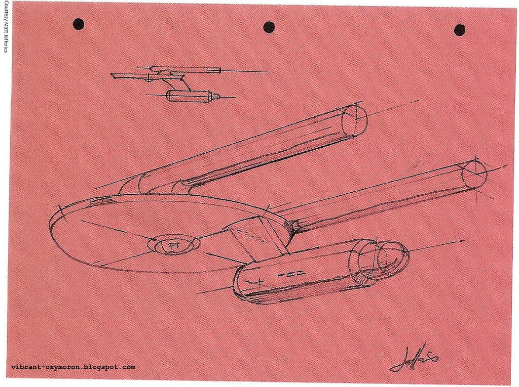

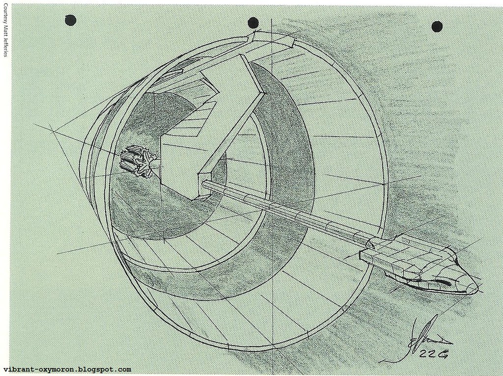
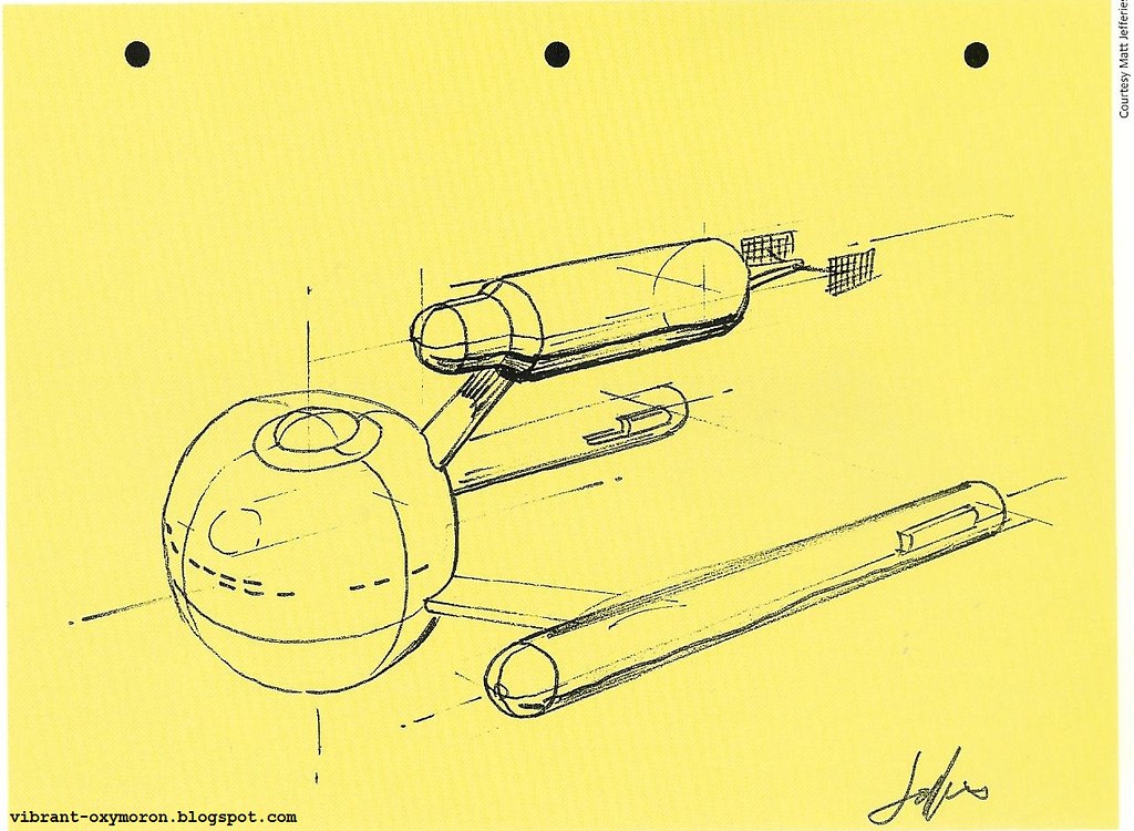
He tried many ideas such as balls and spheres because he wanted to stay away from the typical saucer. Obviously, he ended up using the saucer after all.
"I decided that whatever we came up with had to be instantly recognizable, and to sell the speed it would probably have to start in the distance as a tiny speck of light, and enlarge and come right by your head or go the other way. In that couple of seconds you had to be able to recognize it.
The habitat part I felt ideally should be a ball, but it got too awkward to play with. It just didn’t look like it would get out of first gear, much less the speeds he was talking about. So it gradually got flattened. I was trying to stay away from a saucer because the UFOs or flying saucer were old hat but it did gradually turn it into a saucer." - Matt Jefferies

Because Jefferies was a member of the Aviation Space Writers' Association, he had material that had come out of any company that had to do with space such as NASA, Northrop and Douglas. He would pin them up on the wall as a reference - things that he would not do. He wanted the Enterprise to be entirely unique.
"Gene described the 100-150 man crew, outer space, fantastic, unheard-of speed, and that we didn't have to worry about gravity. He had emphasized that there were to be no fins, no wings, no smoke trails, no flames, no rocket." - Matt Jefferies
When he and Gene Roddenberry finally decided on a design, it was time to make a small model:
"We had a put a little hook in the top of it with a string, but I was holding it underneath. It was made out of balsa wood, except for the two engine pods which were stock birch dowels, which are much heavier than the other wood.I held it up and Gene took it by the string and it immediately flopped upside down. He liked that better. I didn’t. That was one of our biggest arguments which I won, and then when the show hit the air it was on the cover of TV Guide - printed upside down." - Matt Jefferies
Who knows what the Enterprise would have looked like if Walter Matt Jefferies had not been involved? Certainly it would not have been the success it was (and is), as he not only designed the enterprise, but many of the props, sets, and even the Klingon insignia.
fear of god essentials hoodie
ReplyDeleteoff white outlet
golden goose
yeezy 500
golden goose
kyrie shoes
off white nike
kobe byrant shoes
golden goose sneakers
supreme new york
asshk45f12dw
ReplyDeletesupreme outlet
golden goose outlet
golden goose outlet
golden goose outlet
golden goose outlet
golden goose outlet
golden goose outlet
golden goose outlet
golden goose outlet
golden goose outlet